Defensible Trading Performance Dashboard: Expectancy, GIPS, Forensics
Make your trading performance dashboard defensible: prioritize expectancy and rule adherence, follow GIPS/FINRA methods, and add trade reconstruction to...

Defensible Trading Performance Dashboard: Expectancy, GIPS, Forensics
A trading performance dashboard earns its screen space by doing three jobs at once: giving you live situational awareness of open risk, showing risk-adjusted returns you can defend to yourself or an allocator, and surfacing the behavioral patterns quietly eating your edge. Most dashboards fail on the third one. This guide covers the KPIs worth tracking, how to lay them out, how to keep the underlying data honest, and where forensic review fits into the picture.
TL;DR:
- Risk and process metrics like maximum drawdown, rule adherence, and expectancy over 30 to 50 trades are more predictive of long-term edge than short-term P&L figures.
- Dashboard layout should prioritize headline metrics at the top, with equity curves, expectancy, and P&L breakdowns positioned for quick assessment based on trading style.
- Accurate data import requires standardizing timestamps, symbols, fees, and trade dates, with validation checks such as row count reconciliation and random trade spot checks.
- Multi-period risk-adjusted ratios like Sharpe, Treynor, and Jensen should be reviewed over multiple timeframes to avoid misleading short-term results.
- Automated, forensic trade reconstruction enhances dashboard accuracy by resolving data inconsistencies and providing deeper behavioral analysis.
Table of Contents
- Core KPIs Every Trading Performance Dashboard Should Track
- How to Lay Out Widgets on a Trading Analytics Dashboard
- Getting Trade Data Into the Dashboard Without Corrupting It
- Reading Sharpe, Treynor, and Jensen Without Fooling Yourself
- Real-Time Monitoring vs. the Weekly and Monthly Review
- A Quick-Start Checklist for Building Your Dashboard
- How Forensic Trade Reconstruction Sharpens Dashboard Accuracy
- Making Your Dashboard Change Behavior, Not Just Report It
- Where Thefinaltape Fits Into Your Dashboard Workflow
- Standards Worth Knowing Before You Trust Any Metric
- Sources
- FAQ
Core KPIs Every Trading Performance Dashboard Should Track
Raw P&L tells you almost nothing about whether a strategy works. A trader up $40,000 this quarter on one lucky swing trade looks identical to a disciplined scalper on a P&L chart alone, but the two have completely different risk profiles. That’s why serious trading analytics tools separate metrics into three buckets: outcome, risk, and process.
Outcome metrics answer “did the strategy make money, and how efficiently.”
- Net P&L is the baseline, but it means nothing without context on capital at risk.
- Profit factor (gross profit divided by gross loss) above 1.5 generally signals a strategy worth scaling; below 1.2, you’re likely riding variance.
- Expectancy (average dollar result per trade, weighted by win rate and average win/loss size) is the single most predictive outcome metric because it forecasts what happens over the next 100 trades rather than describing the last 100.
- Win rate matters far less than most new traders assume. A 35% win rate with a 3:1 reward-to-risk ratio beats a 65% win rate with a 1:1 ratio every time.
- Average win/average loss ratio exposes whether you’re letting winners run or cutting them short out of fear.
Risk metrics tell you how much pain you absorbed to get that outcome.
- Maximum drawdown (peak-to-trough equity decline) is the number that determines whether you can psychologically and financially survive the strategy long enough to realize its expectancy.
- Drawdown duration matters as much as depth. A 15% drawdown that resolves in three weeks is a different animal than one that drags on for five months.
- Risk of ruin calculations, while less commonly built into off-the-shelf dashboards, estimate the probability of blowing through your account given your position sizing and win rate.
Risk-adjusted metrics separate skill from luck. This is where most retail dashboards stop short, and where risk-adjusted metrics like Sharpe and Jensen provide a more complete picture than nominal profit figures alone, because two traders with identical returns can have taken wildly different amounts of risk to get there. Sharpe, Treynor, and Jensen ratios each measure this differently, and the next section breaks down how to use them.
Process metrics are the quiet workhorses of a well-built trading strategy dashboard.
- Trade count by setup type reveals whether you’re actually following your plan or freelancing.
- Rule adherence (percentage of trades that met your predefined entry/exit criteria) is arguably more useful than any P&L figure for diagnosing discipline problems.
- MAE/MFE (maximum adverse/favorable excursion) shows how far a trade moved against or in your favor before you exited, which is gold for refining stop placement.
- Time-of-day performance often reveals that half your losses cluster in a two-hour window you could simply stop trading.
The metrics that predict durable edge are expectancy, profit factor, and rule adherence tracked over rolling 30 to 50 trade windows. Win rate and single-day P&L are the noisiest and least predictive numbers on the screen, yet they’re what most beginners stare at.
How to Lay Out Widgets on a Trading Analytics Dashboard
The best financial dashboard software treats screen real estate like a newspaper front page: the biggest, most important story goes above the fold, and everything else supports it.
- Headline metric strip. Reserve the top row for net P&L, profit factor, expectancy, and current drawdown, updated in real time. This is the strip you glance at before you do anything else.
- Equity curve, front and center. A smooth, upward-sloping equity curve with a visible drawdown shading is worth more than ten numeric widgets combined. If the curve has jagged spikes, that’s your cue to check position sizing before anything else.
- Rolling expectancy chart. Plot expectancy over the trailing 20 to 50 trades rather than a static all-time number. A rolling window shows you whether your edge is improving, flat, or decaying right now.
- P&L by setup. Break results down by strategy type (breakout, mean reversion, news fade, whatever your taxonomy is). This single widget usually reveals that one or two setups generate almost all your profit while the rest are dead weight or worse.
- Hourly heatmap. A grid of trading hours against average P&L exposes time-of-day patterns fast. Traders are often shocked to find their “best” setup loses money reliably after 2 PM.
- Drawdown curve. Separate from the equity curve, this shows drawdown depth and duration as its own line, which makes recovery periods easier to spot than reading them off an equity chart.
- Recent trades table. A scrollable log of the last 20 to 30 trades with entry, exit, size, and result, filterable by setup and date, closes the loop between the summary widgets and the raw data.
Layout should flex with trading style. Intraday traders need the hourly heatmap and a live open-positions panel front and center, since their edge or lack of one shows up within a session. Swing traders can push the heatmap down and prioritize weekly P&L by setup and a longer rolling expectancy window instead, since their sample sizes accumulate slower. Multi-instrument portfolios need a filter bar that lets you isolate by symbol, asset class, or account, because blending forex scalps with equity swing trades into one undifferentiated equity curve hides more than it reveals.
Filtering is the feature most dashboards get wrong. A trading performance dashboard without the ability to filter by date range, setup, instrument, and session is a static report, not a working tool. Good drill-down UX lets you click any bar on the P&L-by-setup chart and land directly on the filtered trade list behind it, without a separate export or query step.
Getting Trade Data Into the Dashboard Without Corrupting It
Every KPI on your screen is only as trustworthy as the data feeding it, and this is where most homegrown dashboards quietly fall apart.
Trade data usually arrives from one of three sources: broker CSV exports, direct API feeds, or backtest output files. Broker exports are the most common and the most inconsistent. Two brokers can export the identical trade with different column orders, different timestamp formats, and different treatment of partial fills.
Before you trust a single number, run through this mapping checklist:
- Timestamps and time zones. Confirm whether the export uses your local time zone, UTC, or the exchange’s time zone, and standardize everything to one zone before analysis. A dashboard that mixes time zones will scatter your hourly heatmap into meaningless noise.
- Symbol normalization. The same underlying instrument can show up as “ES,” “ES1!,” or “/ES” across different feeds. Inconsistent naming splits what should be one line item into three.
- Commissions and slippage. Some broker exports include fees in the trade P&L; others report gross P&L and list fees separately. Missing this distinction can overstate net profit by a meaningful margin on high-frequency strategies.
- Trade date vs. settlement date. Especially relevant for options and some equity products, where the trade and settlement dates diverge and can throw off period-based performance calculations if you’re not careful about which one you’re filtering on.
Once data is mapped, run simple validation checks before you believe the dashboard: does the row count in your import match the row count in the broker statement, does total P&L in the dashboard reconcile to the account statement’s realized P&L for the same period, and does a random spot-check of five trades match the raw broker confirmation. GIPS guidance around calculation methodology exists precisely because inconsistent return calculation methods produce numbers that can’t be fairly compared, and the same logic applies at the individual trader level. If your dashboard’s return figure can’t survive a reconciliation check against your brokerage statement, the KPIs built on top of it aren’t worth trusting.
Automating this matters once you’re importing data weekly or daily. Build a reusable mapping template per broker so you’re not re-mapping columns every import, and schedule a basic data health check (row counts, P&L reconciliation, duplicate detection) to run automatically rather than relying on memory. Documentation on dashboard validation routines consistently points to mapping templates and scheduled checks as the difference between a dashboard that drifts silently and one that stays trustworthy.
Reading Sharpe, Treynor, and Jensen Without Fooling Yourself
These three ratios answer a question raw P&L can’t: was the return worth the risk taken to get it?
The Sharpe ratio measures excess return per unit of total volatility, capturing both the systematic risk shared with the market and the idiosyncratic risk specific to your strategy. It’s the right tool when you want to know if a strategy’s return justifies its overall bumpiness, regardless of source.
The Treynor ratio measures excess return per unit of beta, or systematic risk only. It’s more useful when comparing strategies that are meant to track or hedge against broader market movement, since it strips out idiosyncratic noise and isolates market-related risk specifically.
The Jensen’s alpha measures the excess return over what CAPM would predict given the strategy’s beta, essentially answering “did this strategy outperform what its market exposure alone would explain.” As Investopedia’s primer on these three ratios lays out, each ratio assumes a different risk model, so picking the wrong one for your strategy type gives you a technically correct number that answers the wrong question.
A few pitfalls trip up even experienced traders reading these numbers off a dashboard.
- Lookback bias. A Sharpe ratio calculated over your three best months will look outstanding and mean almost nothing about forward performance.
- Small-sample volatility. Ratios calculated on fewer than 30 trades or a few weeks of data swing wildly with each new result, so a “great” Sharpe ratio on a small sample can flip negative within a week.
- Benchmark mismatch. Comparing your Treynor ratio against the S&P 500’s beta when you trade crude oil futures produces a number that’s technically calculable and practically meaningless.
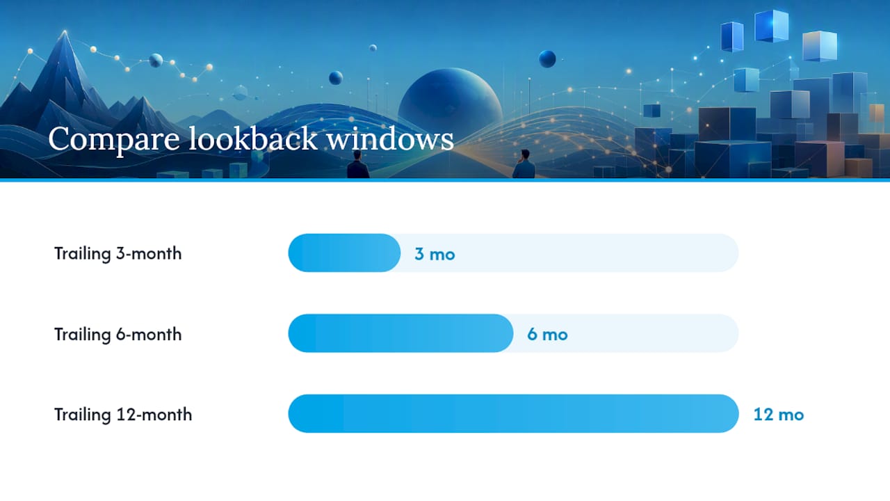
Pro Tip: Never trust a single-period risk-adjusted ratio in isolation. Pull up the same ratio calculated over the trailing 3, 6, and 12 months side by side. If Sharpe looks great over 3 months but collapses over 12, you’re looking at a hot streak, not an edge.
FINRA’s own guidance backs this up directly: evaluating returns against benchmarks over multi-year periods, rather than short-term snapshots, avoids the volatility and survivorship bias that plague short lookback windows. The practical heuristic is to combine a multi-period Sharpe ratio with your current drawdown and expectancy trend before drawing any conclusion. A strategy with a strong 12-month Sharpe, a shallow current drawdown, and rising rolling expectancy is telling a coherent story. A strategy with a great Sharpe ratio sitting on top of a deep, unresolved drawdown is telling you the ratio was calculated before the damage happened.
Real-Time Monitoring vs. the Weekly and Monthly Review
Confusing what belongs on your live screen with what belongs in a periodic review is one of the fastest ways to make bad decisions off good data.
Your live watchlist during trading hours should stay narrow: real-time equity curve, open position exposure, daily P&L against your daily loss limit, and any behavioral or tilt alerts your platform surfaces. Behavioral detectors that flag overtrading or emotional escalation are increasingly treated as first-line alerts precisely because they catch a problem while it’s still a bad afternoon, not a bad month. Anything beyond that during market hours is a distraction dressed up as diligence.
Periodic review is where the deeper analysis happens, on a cadence, off the clock:
- Weekly edge check. Review expectancy, profit factor, and rule adherence for the past five to ten trading days. This is fast, roughly 15 minutes, and catches drift early.
- Monthly attribution. Break P&L down by setup, instrument, and time of day for the full month, and compare against the prior month. This is where you decide whether to scale a setup up or cut it.
- Quarterly or multi-year benchmark comparison. Compare your risk-adjusted returns against a relevant benchmark and against your own multi-year Sharpe trend to see whether the strategy is structurally improving or just having a good quarter.
The guardrail that keeps this cadence honest: never adjust position sizing or abandon a setup based on a single losing week. A five-trade losing streak inside a 200-trade sample with a positive expectancy is statistical noise, not a signal. Save structural changes for what the monthly and quarterly reviews actually show.
A Quick-Start Checklist for Building Your Dashboard
Start with five widgets: headline metric strip, equity curve, rolling expectancy, P&L by setup, and the recent trades table. These five cover outcome, trend, and drill-down in one screen without overbuilding on day one.
Before trusting a single number, validate the data: reconcile row counts against your broker statement, confirm total P&L matches your account statement for the period, and spot-check five random trades against raw confirmations.
Set a reporting cadence immediately, even a simple one: weekly expectancy and rule-adherence check, monthly full attribution by setup and time, quarterly benchmark and multi-period Sharpe review. Write down what each report should include before you need it, so review day doesn’t turn into another data-cleaning session.
Finally, run small experiments and track them explicitly. Test one rule change (a tighter stop, a different entry filter, avoiding a specific time window) for a fixed number of trades, and compare expectancy before and after in a dedicated tab rather than letting it blend into your overall numbers.
How Forensic Trade Reconstruction Sharpens Dashboard Accuracy
Most dashboard errors trace back to messy source data, not bad formulas. Some advanced trading platforms start by reconstructing every trade into a structured dataset, resolving timestamp, fee, and fill-level inconsistencies before any KPI calculation, reflecting principles similar to GIPS methodology applied at the institutional level.
On top of that clean dataset, some systems employ a multi-agent audit: multiple specialist analysts and a coaching officer debate the trade record from different angles, from execution quality to behavioral pattern, rather than producing one generic score. That debate surfaces drivers a single-model summary might flatten, such as a setup that looks profitable overall but varies in profitability depending on the time of day.

The output feeds directly into dashboard-style artifacts: a performance ratios tab that houses Sharpe, Treynor, and expectancy metrics, a temporal performance tab breaking results down by time of day and session, and a prioritized list ranking behavioral errors by estimated financial impact.
Making Your Dashboard Change Behavior, Not Just Report It
A dashboard that only reports numbers is a scoreboard. A dashboard that changes behavior is a coaching tool, and the difference comes down to two rules. First, prioritize expectancy and rule adherence over win rate. Second, schedule weekly experiments rather than reactive tweaks after a bad session. Resist the urge to chase whatever metric looks best this week. Build the dashboard, then argue with it for a month before you trust it.
— DigitalPunk
Where Thefinaltape Fits Into Your Dashboard Workflow
If you’ve built the dashboard described above and are still staring at numbers you can’t fully explain, some specialized platforms aim to close that gap. Instead of a static KPI screen, you get forensic trade reconstruction feeding a performance ratios tab, plus a multi-agent AI Council audit that debates why a metric moved, not just that it moved.
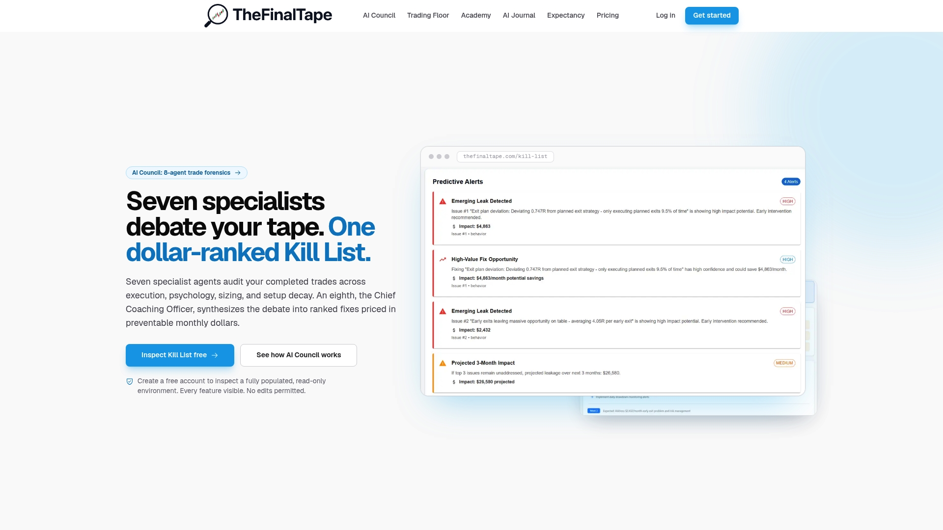
This is suited for traders and desks who already track P&L and expectancy but want more defensible risk-adjusted metrics and insight into behavioral drivers without building the reconciliation pipeline themselves. If you manage a team, the shared workspace gives everyone the same trading journal and analytics solution instead of five different spreadsheets. Start by exploring the trade review software to see how trade reconstruction feeds your dashboard, or work through the Performance Ratios Tab lesson in the Academy to understand exactly how Sharpe and Treynor show up once your data is clean.
Standards Worth Knowing Before You Trust Any Metric
For calculation methodology, GIPS guidance sets the bar for defensible, time-weighted returns. FINRA’s evaluation guidance covers multi-period benchmarking. For ratio definitions, Investopedia’s Sharpe/Treynor/Jensen primer is a solid starting point, and sequence-of-returns risk is worth understanding through resources like Amber Wealth’s breakdown of how return order affects long-term outcomes.
Sources
- FINRA: Evaluating performance
- GIPS calculation methodology (Guidance Statement)
- Investopedia: Measuring a portfolio’s performance (Sharpe/Treynor/Jensen primer)
- Wharton stat: Performance metrics context
FAQ
What Is a Trading Performance Dashboard?
A trading performance dashboard is a single screen combining outcome metrics (P&L, expectancy), risk metrics (drawdown), and risk-adjusted ratios (Sharpe, Treynor, Jensen) so a trader can assess both results and the risk taken to achieve them.
Which KPI Matters Most on a Trading Strategy Dashboard?
Expectancy tends to be the most predictive single metric because it accounts for win rate and average win/loss size together, forecasting likely results over the next batch of trades rather than describing the past.
How Often Should I Review My Dashboard?
Check live metrics like equity curve and daily P&L during trading sessions, run a weekly expectancy and rule-adherence check, and reserve full attribution analysis for monthly and quarterly reviews.
Can Thefinaltape Replace a DIY Trading Dashboard?
Thefinaltape’s platform reconstructs trades into structured datasets and runs AI Council audits on top, producing performance ratios and behavioral insight that a manually built spreadsheet dashboard typically can’t generate on its own.
Why Do My Sharpe Ratio Numbers Keep Changing Week to Week?
Small sample sizes make risk-adjusted ratios volatile; calculating Sharpe over fewer than 30 trades or a few weeks of data produces numbers that swing sharply with each new result rather than reflecting a stable edge.
Recommended
Stop reviewing from memory
Run compliance scoring, tag ranking, and Kill List rules on every trade — not once a month when the account feels off.